Technical Revolution in the Arts.
The Flemish School. At the Heart of the Baroque and the revolution.
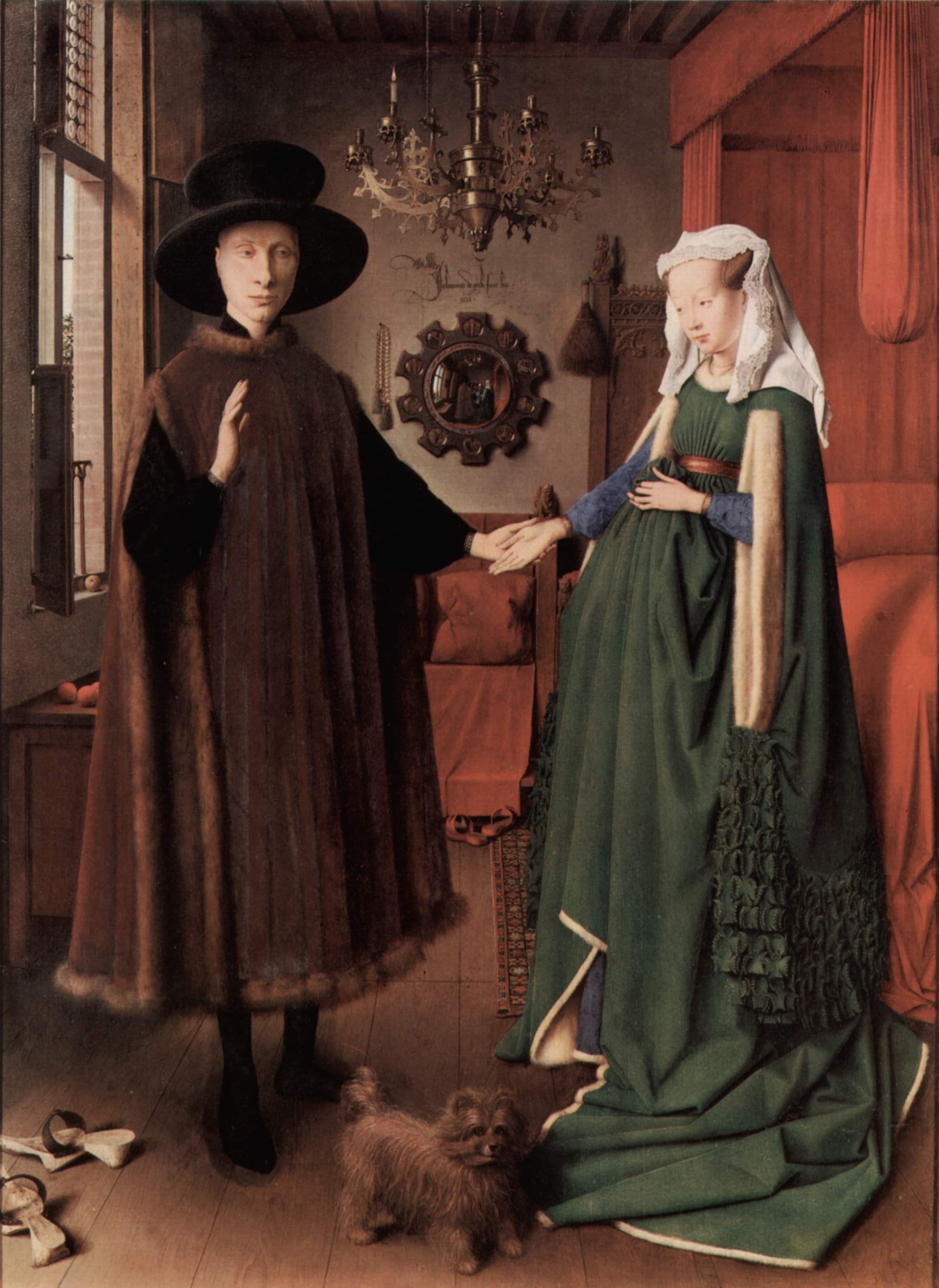
Bruges, around 1420.
A painter named Jan Van Eyck, also known as John of Bruges, addressed a group of artists in his studio, saying: "We continue to paint as they did 100, 200, 300 years ago; the prejudices and conventions of the Gothic era are still ours: our characters stand out against a golden, empty, lifeless background, without connection to reality, to truth. Here is what I propose: let us paint men, women, trees, fields, as they really are. It is daily life, the truth that surrounds us, that I propose we paint." In this studio were the Master of Flémalle, the famous Van der Weyden, and the young and brilliant Petrus Christus. From then on, all strove to paint with the realism preached by John of Bruges. They created a new school: the celebrated Flemish School (1), whose successors were later Bouts, Van der Goes, Memling, Bosch, Bruegel, Van Dyck, Jordaens, Rembrandt... to name but a few. That Van Eyck helped give birth to an artistic movement that was dormant and would have an immense impact in Europe (2) is one thing, but what is more important at the technical level is that he made a fundamental discovery for painting, which even today is the basis of its preservation.
Revolution in Painting Techniques.
Until 1410, the technique used by all artists, whether for paintings or altarpieces, was tempera, or egg tempera (3). Long before, it had already been realised that by applying a layer of oil on egg tempera, the colours, revived, regained the intensity and brilliance of the early days. In the book "Diversarum artium schedula", written in 1200 by the monk Theophilus (5), it was already advised to spread a layer of olive oil on tempera. But olive oil fails to dry, and paintings must be exposed to the sun for hours, even days, at the risk of seeing the paint deteriorate, the colours blacken, the whites lose their intensity (5). Van Eyck found the formula that would revolutionise art, mixing a small amount of "Bruges white varnish" with linseed oil. The result was a varnish that dried in the shade without any difficulty. With this mixture, he could use it liquid, thick, in glazes or covering layers. He then added colour ingredients, and these could then retain their intensities without having to be exposed to the sun.
Composition of Oil Colours.
It can be said that today's paints use, for oil painting, the same ingredients as those used six centuries ago by Van Eyck:
- Colours or pigments. Generally appearing as a powder. They are classified as organic colours of vegetable or animal origin, inorganic or mineral colours, and synthetic colours, born from the chemical industry.
- Binders or liquid substances composed of fatty oils, not forgetting resins, balms, and waxes.
Oil paint does not have exclusive use of the listed pigment colours; they are, in fact, colours and pigments common to all techniques used to make all kinds of colours. They are powdered colours which, mixed with water, gum arabic, honey, and glycerine, give us, for example, watercolour paints. We obtain with water, gummy substances, and oils, pastel colours. Or, in the case at hand, colours ground and bound with fatty oils, resins, balms, and waxes become oil colours.
Colours.
These are powdered pigments, at the time, which can be classified as white, yellow, red, blue and green, brown, and black. The classification remains the same today since the advent of the industrial era, which saw the appearance of paint tubes. In oil painting, as in any other opaque paint, tempera, or as in pastel, white is one of the most used colours. Tubes of white oil paint today are therefore larger than average. Here is an overview of the most used colours since the revolution started by Van Eyck. Some are no longer marketed, others are used only for restoration work, and others are still present in specialised shops.
Whites.
The most common are lead white, also called silver white, zinc white, and titanium white.
- Silver white, its opacity is high, its covering power too, it dries quickly. Its qualities can be used when it comes to a thick paste-based facture. It is also suitable for backgrounds and the first stage. It must not be forgotten that it is very toxic, especially when the artist claims to make his own colours. The mere act of breathing the powder can lead to the most serious consequences. Like all lead-based colours, they risk tarnishing and greying over time. It is not used for watercolour paints.
- Zinc white, the tone is colder than that of silver white. It is less dense, less covering, and dries more slowly. This last characteristic becomes an advantage when the artist who paints in oil in several sessions prefers to work on a not quite dry background. It is not toxic.
- Titanium white, it is a very solid modern pigment, of normal opacity and siccative properties (6), without major defects, hence its use by the majority of artists.
Yellows.
Commonly used are Naples yellow, chrome yellow, yellow ochre, and raw sienna.
- Naples yellow comes from lead antimonate, it is one of the oldest colours. It is opaque and its siccative properties (6) are satisfactory. Toxic like all lead-based colours, it can be mixed with any other colour without alteration, provided it is perfectly pure and of good quality. Rubens used it preferentially, especially for flesh tones.
- Chrome yellow, derived from lead and therefore toxic. Its shades are numerous, from very light yellow tending towards lemon yellow, to very dark yellow almost orange. It is opaque and has good siccative properties. But it offers little resistance to light and tends to blacken, especially in light shades. Cadmium yellows. It is a good colour, powerful, bright, with slow siccative properties, but capable of being mixed with all colours except copper colours, it is not used for fresco painting, but it is excellent and among the most used for oil painting.
- Yellow ochre, it is a classic and one of the oldest earth-based colours, with great colouring and covering power. Unalterable and capable of being mixed with all colours without difficulty, provided it is pure. It is also made artificially without altering these qualities.
- Raw Sienna (7). Colour, also earth-based, which comes from Siena in Italy. It is a beautiful bright colour which, as an oil colour, risks blackening because it must be diluted in a large quantity of oil. It is therefore not recommended to use it for large backgrounds, but it is an excellent pigment when the binder does not require oil, as in tempera or gouache colours.
Reds.
- Burnt Sienna. It offers the same characteristics as raw sienna, only darker, with reddish shades. It can, however, be used in all techniques, including oil, and with less risk of blackening; the old masters used it abundantly, especially the Venetians. Some authors maintain that it was the red used by Rubens to make the reds of flesh tones (8) and the lights reflected therein shine. Vermilion red. It is a luminous mineral-based red, also made artificially, its covering power is great, but its siccative properties are less good. It is used in all techniques, but it tends to blacken in contact with light. It is not advisable to mix it with copper-based colours.
- Cadmium red. It advantageously replaces vermilion red because it does not blacken in light. It is a bright, solid colour, capable of being mixed with all other colours, except copper-based colours such as opaque glass.
- Carmine Lake. Very solid colour that provides a rich range of pink, purple, and carmine tones. It is rather fluid, dries slowly, and can be used in all techniques, except fresco.
Blues and Greens.
- Green earth, it provides a green tending towards khaki brown. It is a very old colour, usable in all techniques with medium siccative properties. It gives a very covering paste.
- Permanent green. It is a luminous light green colour that comes from a mixture of chromium oxide and cadmium lemon yellow. Of great stability.
- Emerald green. It should not be confused with opaque Schweinfurt green, which in turn is called emerald green in some colour tables (9). The latter is not recommended. The green we are referring to is the best of greens, both for its richness and for its stability and solidity.
- Cobalt blue. It is a non-toxic metallic colour that can be used in all techniques. Its covering power is good, its siccative properties satisfactory. But if it is applied to layers of non-dry paint, it cracks. In oil painting, given the amount of oil that is combined, it can, over time, take on a slightly greenish tint. It offers light and dark shades.
- Ultramarine blue, it is cobalt blue. It is a very old colour that comes from a semi-precious stone, Lapis Lazuli. Which explains its very high price since ancient times. Today, it is made artificially, it has good siccative properties, and can be used by all techniques. Except outdoor fresco, because the colour decomposes. It is found in light and dark shades that tend more towards red than cobalt blue.
- Prussian blue. Also called Paris blue when mixed with alumina. It has great covering power, is transparent, dries well but has disadvantages. It is not lightfast, but it has this particularity of returning to its original tone if left in the dark again. Mixing with vermilion red and zinc white is not recommended.
Browns.
- Raw and burnt umber. These two colours are natural, calcined earths, they are very dark. Raw umber has a slight greenish tint, while burnt umber is slightly reddish. Used in all techniques, they do, however, blacken over time. Their siccative properties are rapid. It is not recommended to apply them in thick layers to avoid cracking.
- Cassel earth or Van Dyck brown. With a dark tone, similar to the previous two. It is not recommended for oil backgrounds. Because it cracks easily. It is difficult to work with. It is used for glazes, retouching. In mixtures for limited surfaces. It is, moreover, perfect for watercolour. In fresco, it becomes grey, cold, and dirty.
Blacks.
The best known are lamp black and ivory black.
- Lamp black, rather cold, it is stable and can be used in all techniques.
- Ivory black, warmer, it provides a more intense black than the previous one and is used in all techniques.
Binders.
Linseed oil.
It is a fatty oil extracted by cold pressing from flax seeds. It is light yellow and dries well in three or four days, it must be pure and clean to avoid blackening the colours. It is used to dilute and bind the latter. The quantity used depends on the structure and fineness of the latter. It is also used as a solvent when painting. It is also involved in the preparation of coatings, i.e., in the preparations of canvases, cardboard, boards, etc. It should also be mentioned, as far as fatty oils are concerned, walnut oil and poppy oil, their siccative properties are slower.
Turpentine spirit.
It is a volatile oil of vegetable origin. It is white, transparent and has a strong and aromatic smell. In contact with air, it dries quickly by evaporation. It is not a binder in the strict sense, but a replaceable means of diluting colours and dissolving balms, resins, and wax. It is also the best solvent for oil colours at the very moment of painting.
Mastic gum and Ammar gum.
These are resins used in oil painting as a varnish and thinner, which should prevent and avoid wrinkles, the formation of a veil on the colours and subsequently their contraction and destruction in case the paint dries from the inside. They are soluble in a water bath in turpentine spirit. But these varnishes risk darkening and also veiling over time.
Beeswax.
It is virgin wax, in oil painting, it serves as a binder for tube colours. It prevents the oil from separating from the colours and eliminates the risk of solidification and drying in the tube. It gives the colour a better consistency. A mixture of 2% melted wax and turpentine spirit is enough to achieve this result.
Brushes.
"Give me, please, 2 or 3 brushes for painting" (10).
If you say only that, the salesman will take out three large boxes divided into compartments, inside which the brushes are classified by number.
The brushes are made of hog bristle and in each box, there will be a particular model, in one they will be tapered, in the other, they will be flat. The brushes commonly used for oil painting are brushes called hog bristle. But marten bristle, mongoose bristle or ox hair brushes are also used for certain surfaces. Hog bristles are harder and stiffer. They give a more expressive touch in which it is even possible to see, in almost all cases, the furrows left by the pressure of the bristles. It is the indispensable brush for backgrounds and large surfaces to blur and degrade regardless of the dimensions of the surface to be treated. Marten hair brushes are more suited to a less rough painting style, where the coloured layers are regularly flat. But they are also indispensable for drawing as well as for the colour of small shapes, for small details, for very fine lines. In an oil portrait, for example, after painting the lips with a hog bristle brush, it will be necessary to use pointed and round marten bristle brushes to paint the line corresponding to the corner. And the line that separates them. It will also be essential to represent, with a dark line, the line that corresponds to the eyelash.
Spatulas or knives.
A spatula is a kind of knife with a wooden handle and a flexible and non-cutting steel blade. This is, of course, a general definition. There are spatulas with round ends, others are triangular and others have the characteristic shape of mason's trowels. Only the blade is narrower. In oil painting, the spatula is used for several reasons: to scrape still soft paint directly on the painting, to clean a defined surface, to rectify, to erase, to clean the palette once the session is over and to paint using the spatula as a brush. To scrape directly on the painting or the palette, it is necessary to use knife-shaped spatulas. With the finest and most flexible, it is a question of rectifying or erasing directly on the painting, with the hardest blade, it is a question of rubbing and cleaning the palette.
Usefulness in restoration and certification.
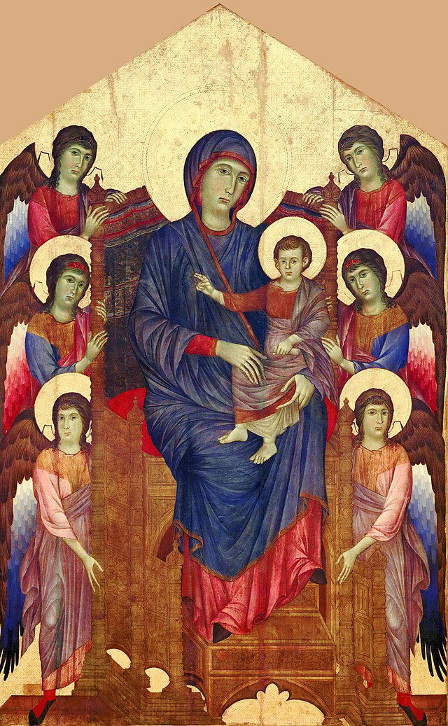
"Virgin and Child with Angels". Gothic painting by the Florentine artist Cimabue, around 1272 "Louvre Museum, in Paris".
Cimabue was undoubtedly one of the artists whose efforts to humanise Gothic art would give the best results. However, his style reflects the usual characteristics of Gothic painting: characters on a golden, unreal background, fixed expressions and attitudes, conventional composition. These characteristics would remain unchanged until the end of the 13th century, which marks the entry into the scene of Giotto, a great precursor of modern painting.
The magic recipes of the time.
Before the industrial era, the manufacture of paint did not pose any problems in itself. It was a question of diluting the powdered colour in oil, grinding it in a mortar or by hand, even on stone, taking care to prepare the oil mixed with varnish and waxes beforehand. It was a work of craftsman and alchemist, which required a lot of time from the artist. The difficulty was to find pure, good quality products; the artist had to study one or more formulas adapted to his way of painting. These had also to offer a minimum guarantee as to their siccative properties, their unalterability, their solidity, and their future preservation. It can be said, if we judge by the number of formulas and proportions known, that each master had his own. While Leonardo da Vinci changed the oil each time, Dürer used walnut oil that he filtered with sifted charcoal; Titian used lavender essence and poppy oil clarified in the sun, and Rubens is known to have painted with copal varnish, poppy oil and lavender essence. The knowledge of these recipes is nowadays very useful for estimations, to recognise a work and authenticate it. For example, Bernardino de Scapis is considered to be a pupil of Leonardo da Vinci, so much his paintings and his style are directly inspired by the great master. This can be disturbing to compare a work that could be attributed to both. But Scapis does not use the same recipes as da Vinci.
Conclusion.
Experts who consult specialised books on painting techniques and materials conclude that, indeed, paints had to be prepared by oneself from Antiquity to the Middle Ages and in other eras. But practical order was required. All documents, all books of the past, when they tell us about the workshops of the great old masters, such as Goya, passing through Titian, Leonardo da Vinci, Michelangelo, Raphael, Velázquez, describe them as a large room inside which were arranged a kind of kitchen or alchemist's laboratory, sometimes an adjoining room or a rudimentary oratory. The artist made his colours there, in oil, tempera, fresco. We can imagine, in agreement with the learned scholar Maurice Bousset (11), a laboratory with shelves loaded with vials and flasks, carefully labelled and hermetically sealed. We could have read names still in use today in the colour tables of modern manufacturers: lead white, Naples yellows, Veronese green, ultramarine blue, near bottles and terracotta pots, a whole range of liquids and oil varnish products with familiar names: linseed oil, walnut oil, mastic gum, turpentine spirit, virgin wax. In a corner, a fire and in the centre, in front of the shelves, a sturdy table covered with a porphyry plate. Nearby, several mortars, pestles, spatulas, brushes, graduated test tubes. The manufacture did not pose a problem in itself. It was a question of diluting the powdered colour in oil, grinding it in the mortar or by hand or even on stone, taking care to prepare the oil mixed with varnish and wax beforehand. It was a work of craftsman which required a lot of time from the artist. Often, he left this to his apprentices. The difficulty was to always find pure and good quality products. These tests and artisan research, sometimes crowned with success, sometimes doomed to failure, continued until Van Eyck's revolutionary idea. Then the industrial revolution also seized the field of colour manufacture and factories were born. Initially modest, it is not surprising that the latter, either by lack of experience or by lack of scruples, manufactured very bad colours which, a few years later, yellowed or blackened, did not tolerate any mixing, etc. Unfortunately, these industrial beginnings coincided with one of the most spectacular movements of modern painting, Impressionism.
This revolutionary way of painting required thick layers of coloured pastes, flat backgrounds, bright, luminous colours. The inevitable happened: the Impressionists used these brand new colours and their paintings served as guinea pigs. Numerous paintings today are stained with altered colours, white skin almost yellow, blue that turns green, brown and blackened ochres. The 19th-century industrialists had just put an end to Van Eyck's genius through opportunism.
Embun Rose DH.
References & notes.
1 : https://www.britannica.com/art/Flemish-art
2 : https://magazine.artland.com/baroque-art-definition-style/
3 : https://www.britannica.com/art/tempera-painting
4 :https://books.google.ca/books?id=wo4EAAAAYAAJ&printsec=frontcover&redir_esc=y#v=onepage&q&f=false
5 : https://fineart-restoration.co.uk/news/the-grand-genre-classical-history-painting-restoration/
9 : A classic mistake for amateurs, or even for nonrestorers and other painting professionals. But an expert eye is not mistaken.
10 : The author of these lines is an amateur calligrapher who has been using brushes since she was 5 years old. Although I almost exclusively use pigskin brushes, wolfhair and goatskin brushes, although expensive and rare, are the best for painting sumptuous and colourful calligraphic works.
11 : https://www.persee.fr/doc/linly_0366-1326_1941_num_10_10_9624